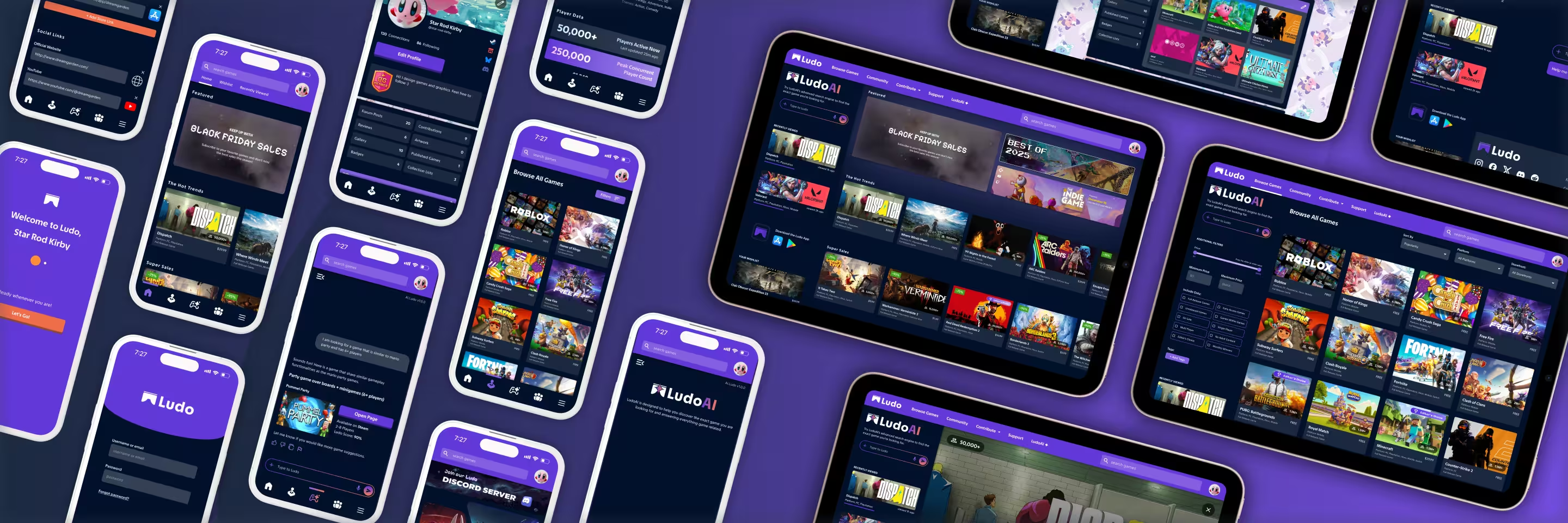
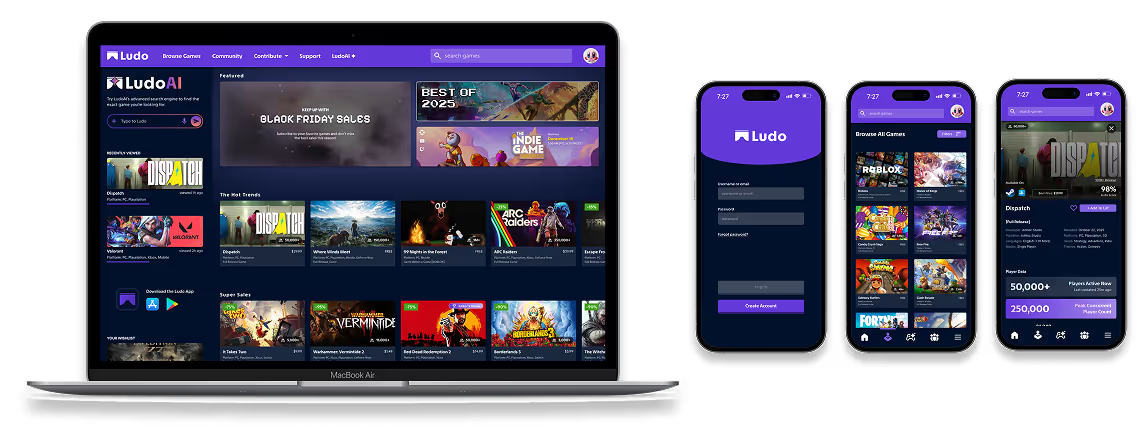
HOME
ludo thumbnail with laptop screen and 3 phone screens showing final UI of the product

Ludo App & Website

2025-2026
Explore the world-wide database of video games encompassing all platforms, genres, communities, players, and creators.

The Challenge

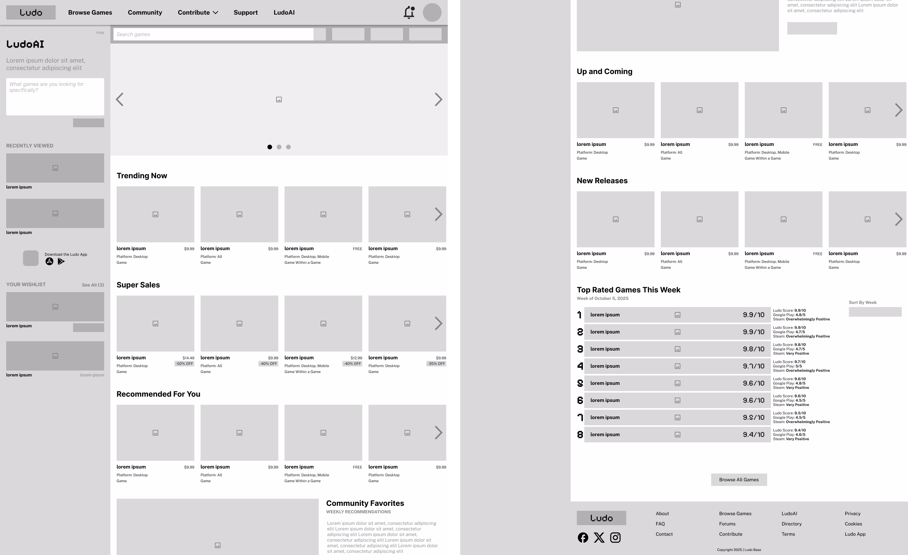
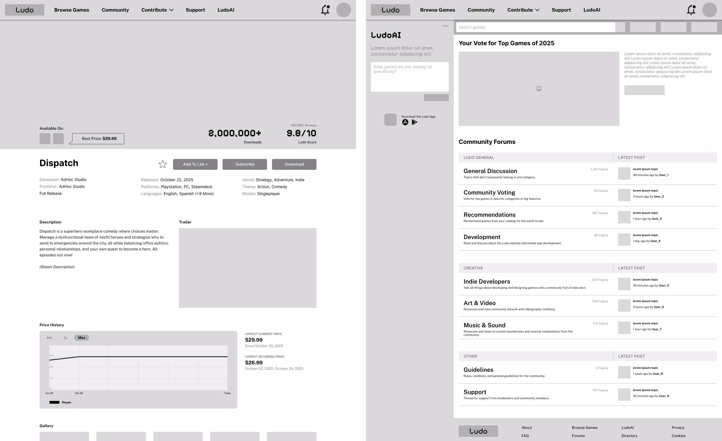
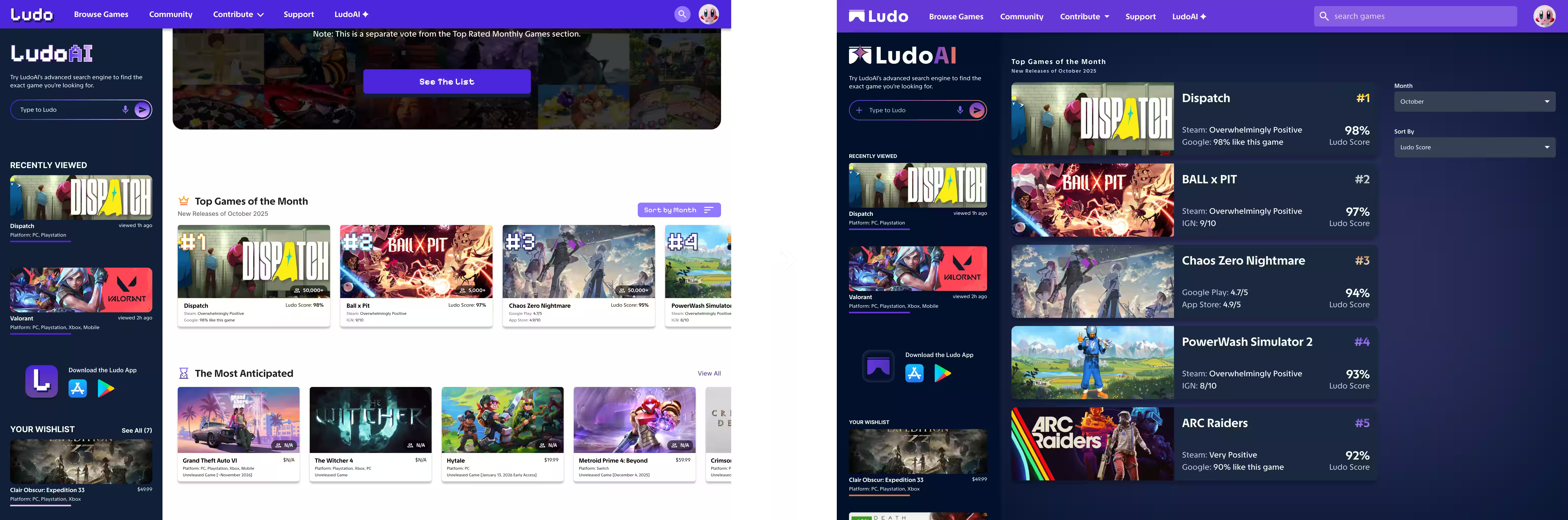
The video game industry is fragmented across platforms, storefronts, and communities, making it difficult for users to reliably discover games, sales, and trends. The dramatic expansion of the gaming market and its vast player base has created an increasing disconnect between users and the overall gaming ecosystem.
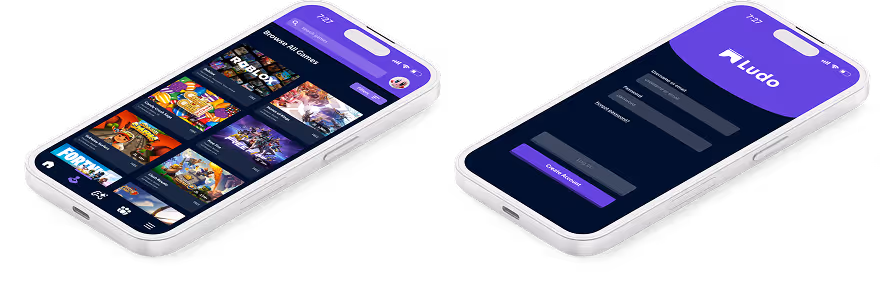
The Solution

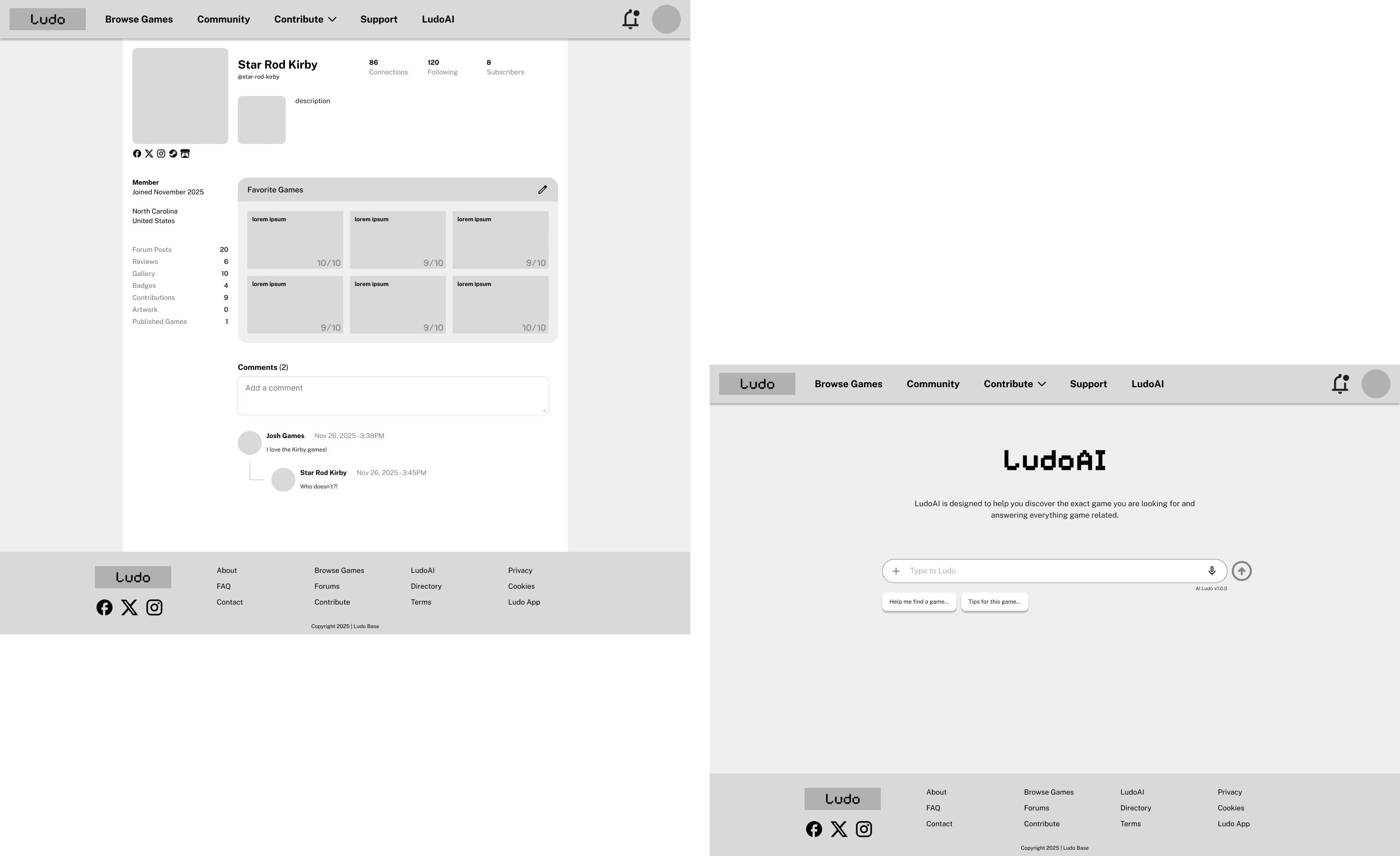
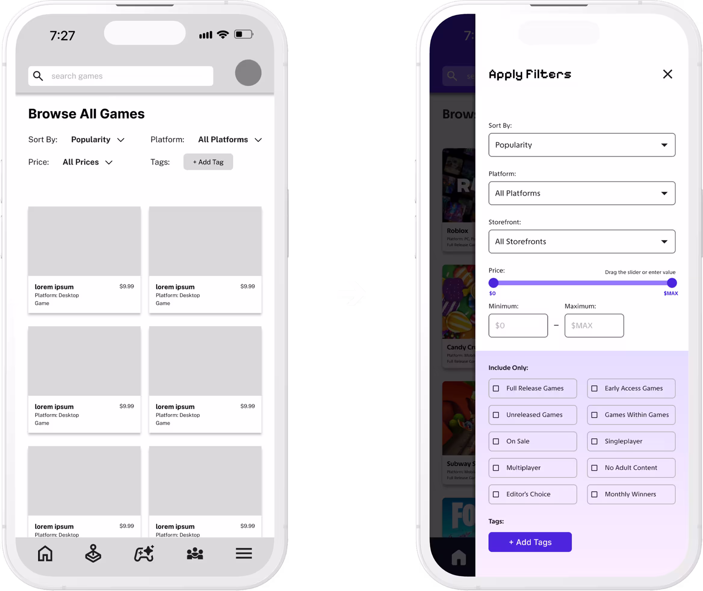
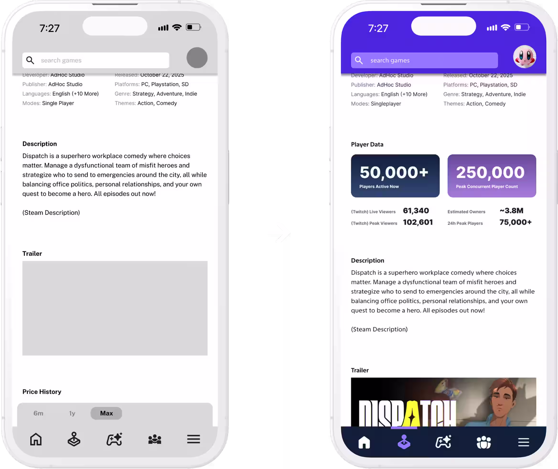
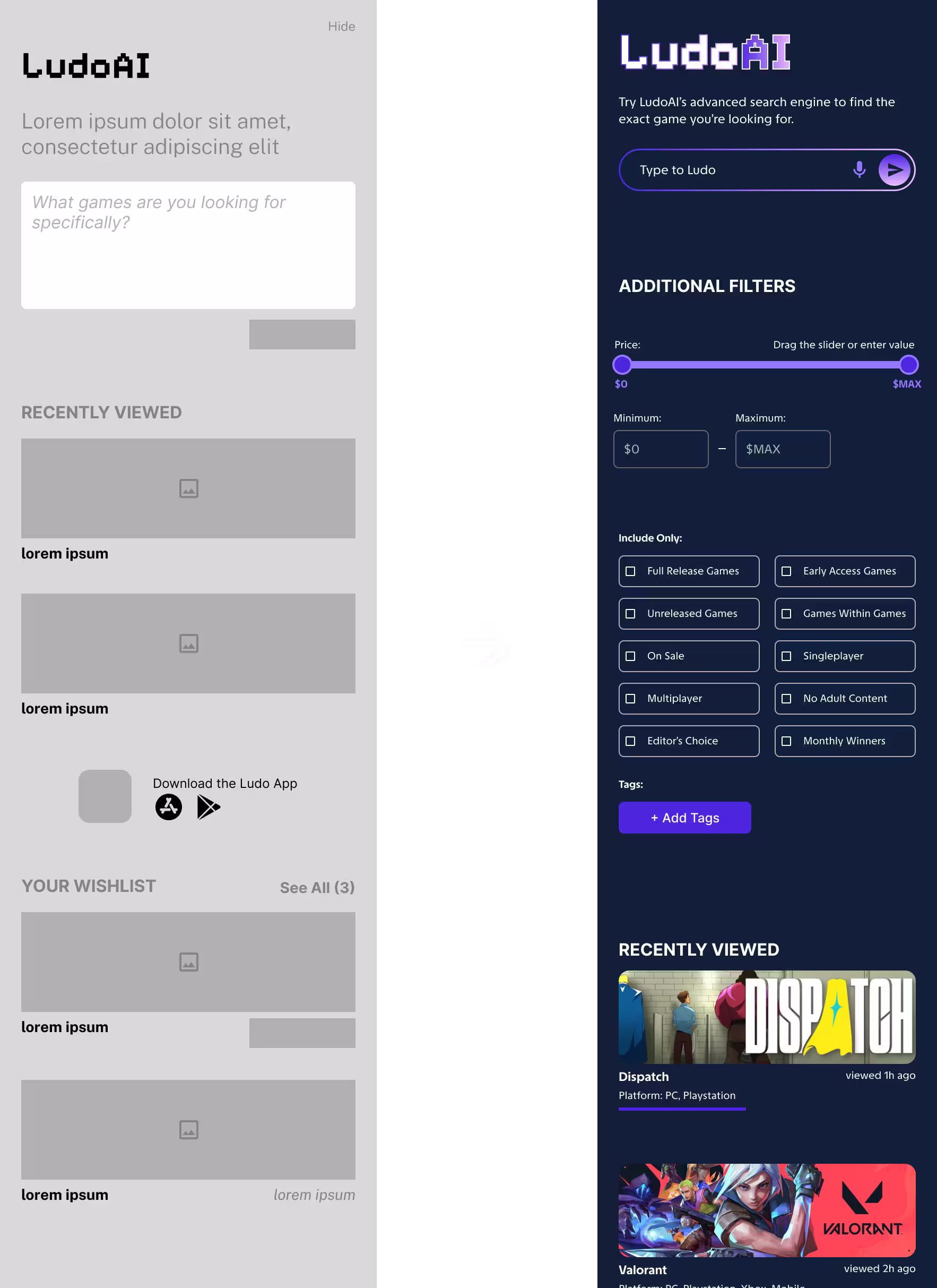
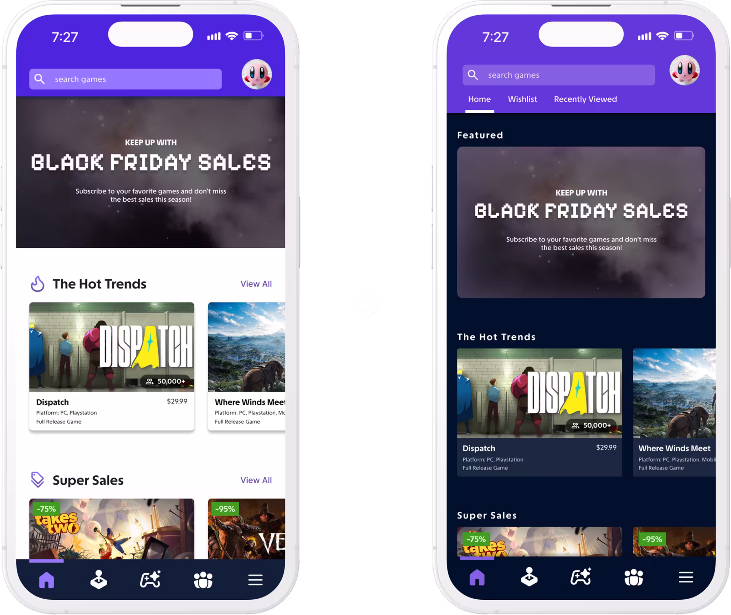
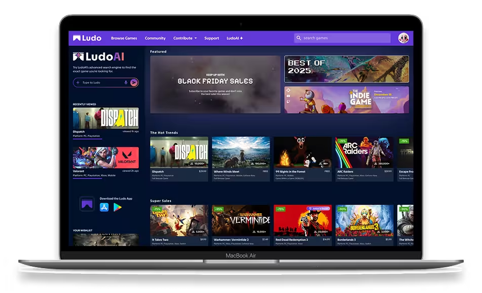
Ludo serves as a global hub of video games across all genres, platforms, and storefronts. It aims to provide reliable data on every game that is publicly available whether its a triple A title, or a small indie game. Having a centralized database allows users to track and organize games in one place without having to navigate various storefronts.

2 phones in 3d view showing UI design of Ludo
01 EMPATHIZE

Preliminary Research

The concept originated from frustrations shared by myself and friends, sparking a question of whether others also wanted a comprehensive gaming database that includes every game ever published regardless of platform.

In summary of the findings, users do share this frustration and are often led to websites that have the database they’re looking for but fail to deliver in-depth filters, have unappealing UI, and most likely won’t use it again.

Because user frustrations depended largely on existing products or the absence of them, conducting competitive analysis and user interviews became the imperative next steps.

Competitive Analysis

Steam’s position as a powerhouse storefront makes it integral to competitive analysis, both for understanding industry standards and evaluating Steam’s own strengths and limitations. Moving forward, I conducted audits for the following products:

Steam logo
Steam
IGDB logo
IGDB
itch.io logo
Itch.io
Backloggd logo
Backloggd
MobyGames logo
MobyGames

User Interviews

5 participants were interviewed one-on-one with a focus on the gaming ecosystem as a whole and how existing platforms shape their behaviors and pain points. Compiling the interviews, I created an affinity map, and synthesized the data into 5 categories:

Empathy Maps

Taking the categorized affinity maps, I created two aggregated empathy maps representing two types of users:

empathy map for data driven explorer
empathy map for discovery focused gamer

User Personas

Finally, I synthesized the empathy maps into two user personas to guide and understand who I am designing for.

User persona Jordan as a data-driven explorer
User persona Maya as a discovery-focused gamer

Applying the user personas and analyzed insights, I began to ideate how “Jordan” and “Maya” would interact with the product.

02 IDEATE

The Information Architecture

Creating a sitemap helped envision the navigation sequence a user would experience in order to reach their goals. This helped with organizing the traffic between the starting point and the end goal, which meant having to get rid of unnecessary pages or rethinking the layout.

Graphic representation of Ludo sitemap

User Flow

Given Ludo’s complex open-ended format, picking a prominent user flow was more realistic than outlining the entire app’s flow. The prominent flow in this case was to “find a game.

User flow for finding a game
Critical Point

A large consideration was the importance of desktop versions as that would make up a bulk of users. Both platforms (app, website) were integral to the core function of Ludo, so moving forward, I developed an app version and a website version of Ludo.

Paper Wireframes

I began visualizing pen on paper designs and sketches to regurgitate as many ideas as possible efficiently. To not lose focus on the objective, I referenced the information architecture to guide design decisions and “doodle with a purpose.”

Paper wireframe sketches of Ludo

Having the design outline and information I need, I prepare to move from paper to digital wireframing starting with the mobile app’s low fidelity prototype.

03 PROTOTYPE

Low-Fidelity Prototypes

To maintain an efficient design process, I opted to follow the mobile-first philosophy even if more users would use the website/desktop version. This work flow allowed me to focus on adaptability and content hierarchy.

low-fidelity prototypes mobile
low-fidelity prototypes desktop

Iteration

After conducting usability studies with participants, which included simulating scenarios and answering prompts, I was able to produce more iterations based on their feedback. After acknowledging the feedback and curating iterations, high-fidelity mockups were produced.

It’s important to note the website prototype was subsequently presented after the mobile app, allowing users to directly compare both experiences while highlighting inconsistencies between them.

Improved Filter

Visual clutter on a critical feature was harmful to the user’s experience.

A slide-out panel with detailed and organized filter options created a more intuitive flow.

low-fidelity prototype of game filters to high-fidelity improved filters
low-fidelity prototype of game game page stats to high-fidelity game page stats

Additional Statistics

The actual game page needed more interesting data and statistics.

The addition of Twitch stats and even more game data incentivized page engagement.

Refined Navigation Bar

Website nav bar lacked direction and displayed inconsistencies to its mobile counterpart.

Cleaning the clutter and aligning the search bar creates more familiarity and visual appeal.

low fidelity desktop navbar to high fidelity imrpoved desktop navbar
low-fidelity prototype of desktop sidebar to high-fidelity sidebar

Utilized Sidebar

The sidebar appears as a website exclusive feature to make use of repetitive space, however there was more practical potential.

I took this opportunity to implement the improved filter design, and in other instances, optimized layouts with toggleable features.

High-Fidelity Prototypes

The two high-fidelity prototypes were fully completed and ready for the last round of usability tests allowing users to fully experience what the app feels and looks like. Once the usability tests were completed, this is when I ran into another critical point with the product.

Critical Point

Usability tests revealed style concerns including color and typography legibility, which were shared concerns from myself but further reinforced after feedback. This prompted a design overhaul and a re-evaluation of the style guide.

Improved Contrast

The harsh contrast from dark colors to bright white had to be addressed.

A seamless transition from a dark backdrop and the nav bar was still distinguishable from another.

high-fidelity mobile prototype and improved version with better colors
high-fidelity mobile prototype and improved top nav bar version

Polished & Consistent

The desktop version’s “Wishlist” and “Recently Viewed” was not included in the mobile version.

Adding this to the top nav bar created a more polished look to the home screen.

Polished & Consistent

Some sections suffered from repetitive patterns that were different but not different enough.

Creating disruptions in layout patterns resulted in increased engagement and clarity, especially when trying to simplify overwhelming information. In the case with “Top Games of the Month,” I opted to use a different card design that distinguished itself from the familiar horizontal scroller game cards.

high-fidelity desktop prototype and improved version with better color and organization

The evolution from wireframe to both iterations of high-fidelity mockups was a challenging process but the improved product resonated well with users.

04 FINAL DESIGN

Style Guide

Style guide for Ludo including colors, typography, and assets

View The Final Prototype

Mobile views of Ludo screens

Mobile App

Figma Prototype
Laptop view of Ludo home page

Desktop/Website

Figma Prototype
Many mobile screens and large screens showcasing final UI of Ludo
05 TAKEAWAYS

Takeaways

Ludo represents the enthusiasm that I, and many others, have for video games. It was a project that became increasingly more ambitious and complex, but the journey was undeniably enjoyable. Every iteration was a direct improvement from before, which was backed by user feedback. The two critical points were the most challenging to address especially considering time and budget constraints.

I learned that your target users will give the greatest insight on why someone would use my product over a competitor’s product. Even if a base idea is solid, it needs to be met with user-centric solutions, and I am excited to bring this mindset to future projects.

Check out another project below